Adapt Strength & Performance
Branding
Branding
DESIGN CHALLENGE
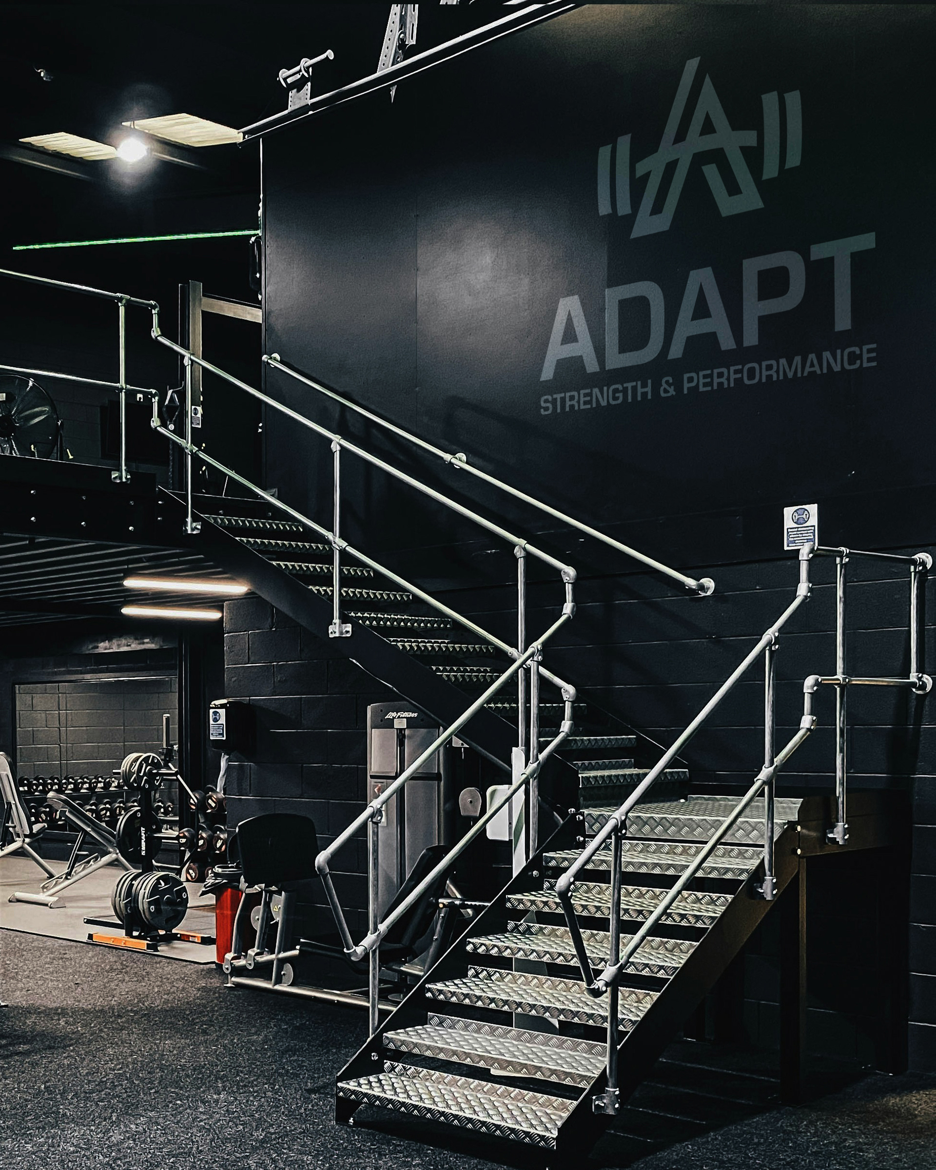
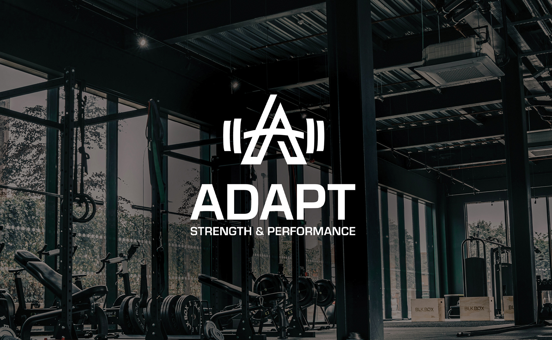
Adapt Strength & Conditioning needed a brand identity that matched its high-performance training philosophy: modern, professional, and built for results. The goal was to create a visual system that reflected the gym’s adaptive, science-backed approach to personal training — while staying clean, minimal, and approachable.
Adapt Strength & Conditioning needed a brand identity that matched its high-performance training philosophy: modern, professional, and built for results. The goal was to create a visual system that reflected the gym’s adaptive, science-backed approach to personal training — while staying clean, minimal, and approachable.
DESIGN SOLUTION
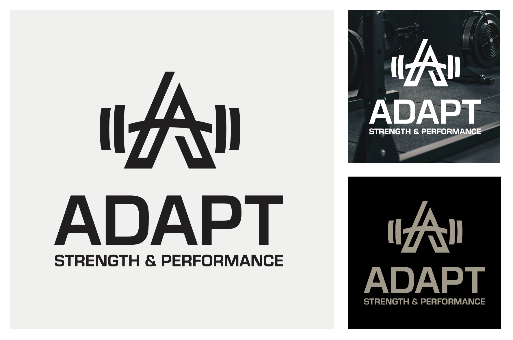
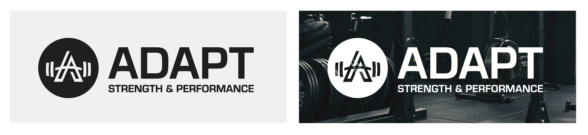
The solution was a sleek, contemporary identity grounded in simplicity and strength. The logo features bold shapes and letters with clean geometry and sharp edges — symbolizing precision, discipline, and forward momentum. A refined, neutral color scheme was chosen to support the brand’s elevated and minimalist aesthetic. Shades of graphite, white form the core palette, complemented by a grey-gold accent to add warmth and visual interest without overwhelming the design. The final identity is sleek, versatile, and grounded — a direct reflection of Adapt’s commitment to high-level performance and intelligent training.
The solution was a sleek, contemporary identity grounded in simplicity and strength. The logo features bold shapes and letters with clean geometry and sharp edges — symbolizing precision, discipline, and forward momentum. A refined, neutral color scheme was chosen to support the brand’s elevated and minimalist aesthetic. Shades of graphite, white form the core palette, complemented by a grey-gold accent to add warmth and visual interest without overwhelming the design. The final identity is sleek, versatile, and grounded — a direct reflection of Adapt’s commitment to high-level performance and intelligent training.